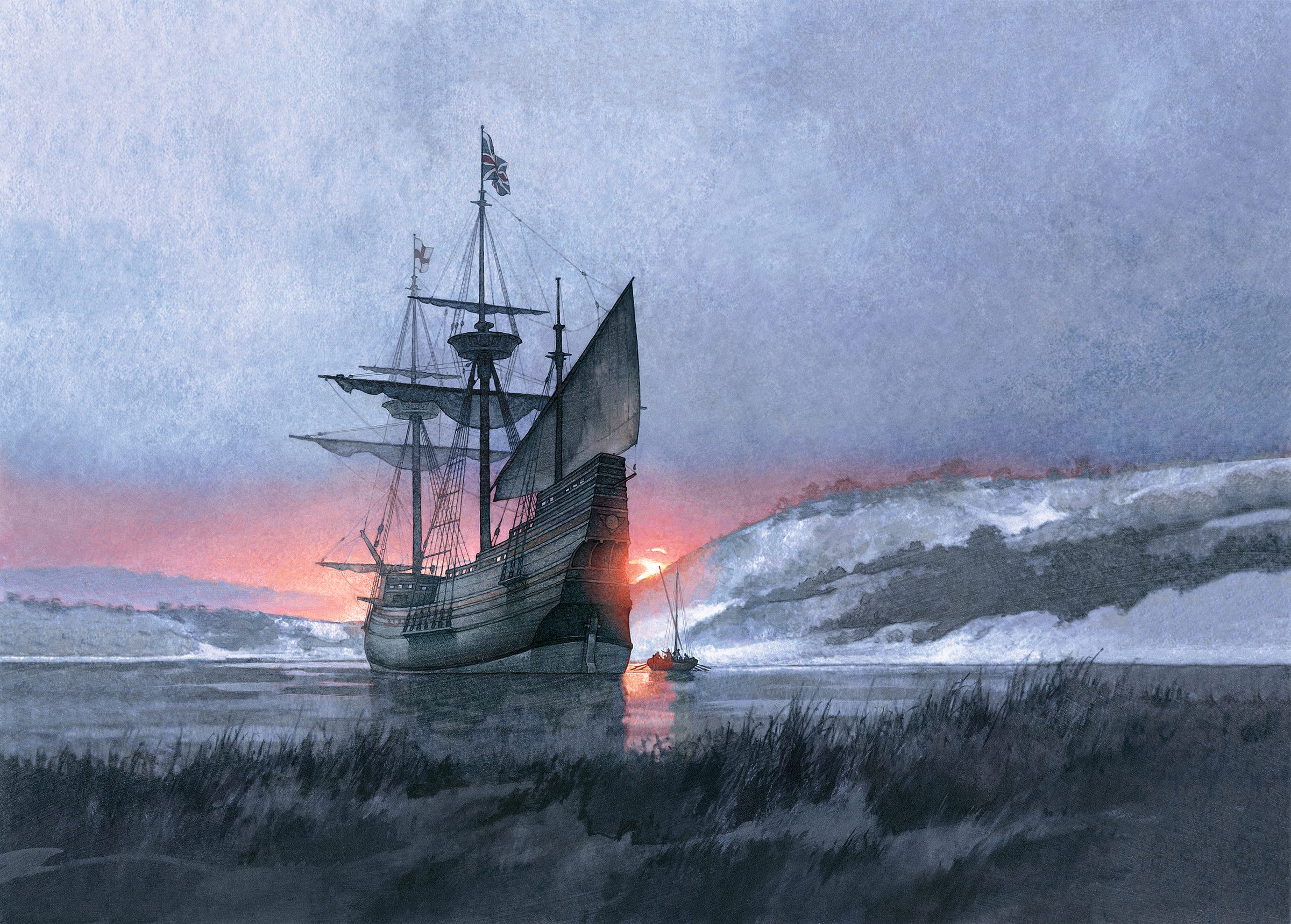
In the spring of 2018, I was awarded the art direction of a new stamp commemorating the arrival of the Mayflower in the New World.
Every assignment is an honor, but for my baby boomer generation, the story of the first Thanksgiving — when the new settlers from England feasted with the indigenous Wampanoag Tribe — is especially cherished. As a child, I found the idea of disparate people coming together in collaborative peace compelling and hopeful. I still do.
But how much of this nostalgic narrative reflects what really happened?
As with any substantive design project, I began with some basic research and discovered Nathaniel Philbrick’s book, Mayflower. Written in 2006, it became (at the time) the definitive text on this 400-year-old story of the Pilgrims’ journey. With fresh discoveries at his disposal, Philbrick’s lively account was praised by critics and especially by the New York Times:
“This is a story that needs to be continually refreshed, and Philbrick has recast the Pilgrims for our age of searching and turmoil. He gives what a 21st-century reader needs to find in the material: perspectives of both the English Americans and the Native Americans.”
Philbrick does not shy away from the brutal and sometimes barbaric narrative, contrary to my elementary school indoctrination. Rather, he recognizes that the new beginning for the Pilgrims was also the beginning of a kind of ending for the indigenous peoples of North America. As Philbrick writes, “Instead of the story we already know, it becomes the story we need to know.”
With some renewed confidence in the fuller story, my colleagues at USPS and I began to imagine how to visually narrate this epic moment in American history. While tangled and troublesome questions permeate the story, the landing of the Pilgrims in Plymouth Harbor is nevertheless a monumental occasion for the ensuing history of the United States.
Attempting to learn from past efforts to commemorate this extraordinary point in time, we first took a careful look at the many historic paintings of the Pilgrims’ first meeting of the Wampanoag Tribe in 1620. Most of the artwork depicts a warm welcome or, very often, portrays some highly romanticized pastiche of the first Thanksgiving. Since so much doubt has been cast upon what really happened and, not least, because we were looking to visualize a fresh portrayal, we began to look for other ways to tell the story.
We moved on to consider other historical paintings of the famous ship, especially The Mayflower on Her Arrival in Plymouth Harbor by William Formsby Halsall. Painted in 1882, the Mayflower is shown at dawn after her landing in Plymouth Harbor. At first blush, we wondered if this historic painting might in itself provide the artwork for the stamp design.
However, even though this momentous painting portrays a luminous sky, the hull of the ship is so dark as to be potentially troublesome to reproduce. What’s more, the discovery of inaccuracies in the ship’s rendering have diminished confidence in the painting over the years.
But in the mid-1950s, a seaworthy replica was built named Mayflower II. The American Museum, Plimoth Plantation, provided reconstructed blueprints to English shipbuilders who employed traditional methods. This full-scale replica, currently being renovated, provided the impetus to create new art that would be more historically accurate and provide the fresh visual narrative we were eager to create.
What is most gratifying in my work as an art director for USPS is the opportunity to commission and collaborate with America’s very best artists. And while the process of researching the right artist for any stamp project can be exhilarating, it is often overwhelming. But for the Mayflower I knew from the beginning that I wanted to work with painter Greg Harlin.
We first worked together for a series of stamps commemorating the War of 1812, and it was then I discovered how Greg earned his tremendous reputation as a historical painter. I was impressed by his insatiable curiosity for historic detail, but what made him so exceptional was his extraordinary felicity for recreating authentic narrative. He strives for his paintings to engage viewers in the story.
So when I queried him about painting the Mayflower I knew he’d be eager to set sail.
Having decided to explore the landing of the Mayflower in Plymouth Harbor, Greg was eager to learn more. What were the features of the landscape in 1620? What time of day did the Mayflower first drop anchor? And given the winter context, would there have been snow on the ground, and from which direction would the sun be rising?
What I brought to our deliberations, I think, was the idea of anticipation. Although much of what happened after the Pilgrims clambered onto the rocks of New England is unknowable, there is an appropriate sense of hope in the scene of the Mayflower entering the New World. We were both motivated to represent the historical moment faithfully but also to create some sense of beauty and uncertainty of what lay ahead.
Greg’s bio describes him as “having spent much of his working years living in the past,” so with new discoveries in hand, he began to create sketches. Photographs and documentation from the replica, Mayflower II, provided invaluable information about the details of the original ship. He created five unique sketches of the Mayflower entering the bay with concise, almost poetic, commentary.
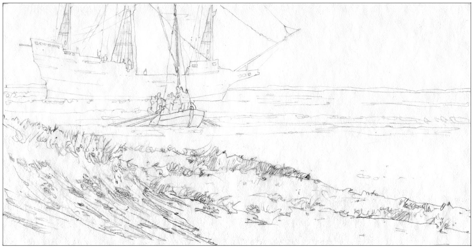
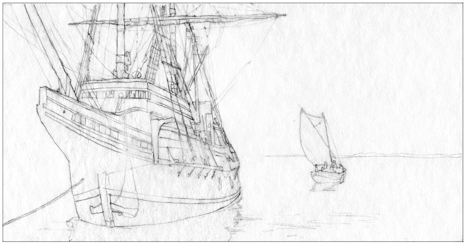
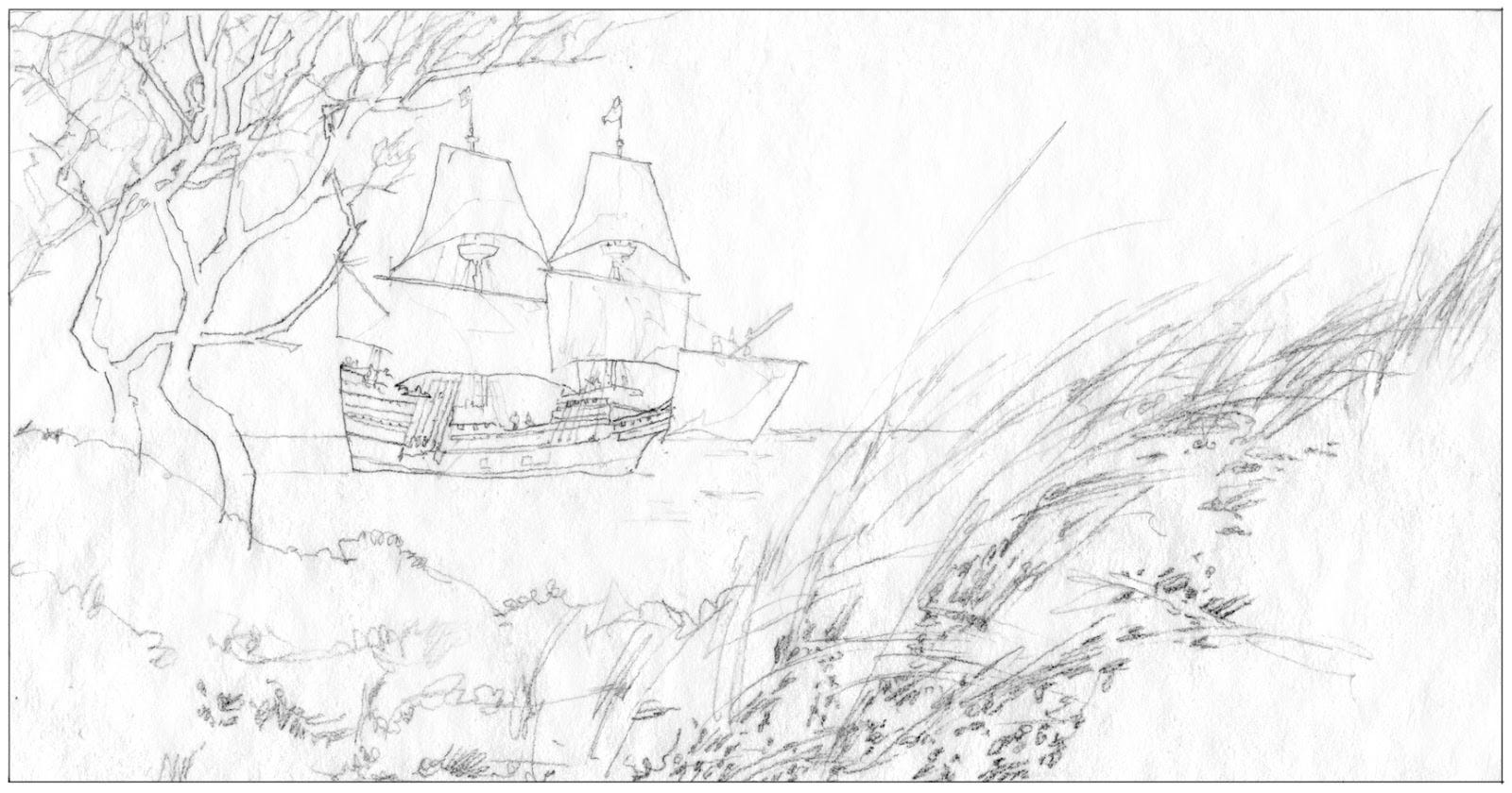
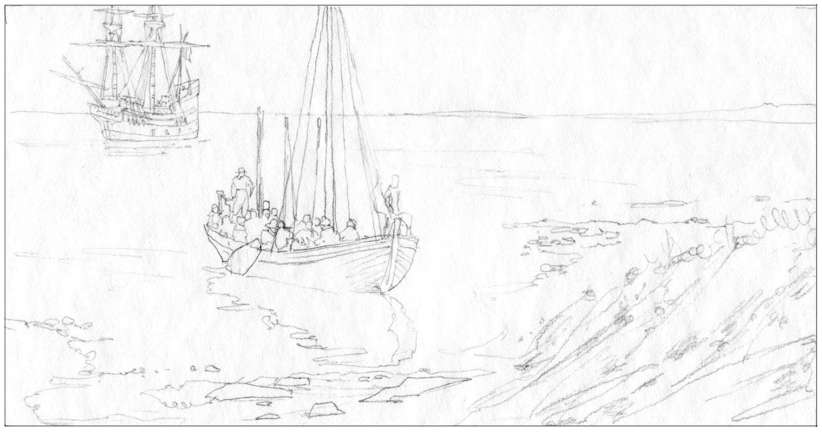
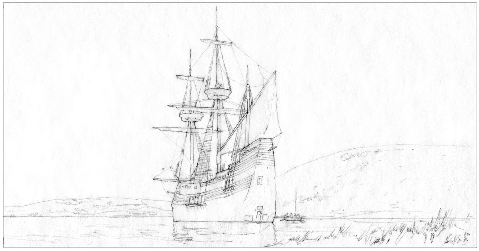
These days, most original artwork is either created digitally or, if painted with traditional methods like watercolor, digitally scanned so that I most often receive sketches via email. While not as emotionally gratifying as receiving a physical package with original art, I still get excited every time I see an attachment symbol with an email from an artist. It’s almost like getting a stamped letter in my mailbox at home.
As I gushed through my first look at his explorations, Greg and I jumped on the phone to discuss next steps. Although each sketch would have made a beautiful painting, we agreed that there was something special about this last sketch. In Greg’s words, the “strong verticals of the ship are foreign to the landscape’s horizontals,” which demonstrates how form (and not just content) can create dissonance to evoke emotion — and in this instance, a sense of beautiful but foreboding awareness.
I remember discussing the sketches with Greg, especially his ability to articulate his thinking behind each one. We agreed that the ship anchored in Plymouth Harbor — with its small envoy pushing out toward the shore — had the most potential for being hauntingly beautiful. As a follow-up to our conversation, Greg created a color study to help us better evaluate this promising direction.
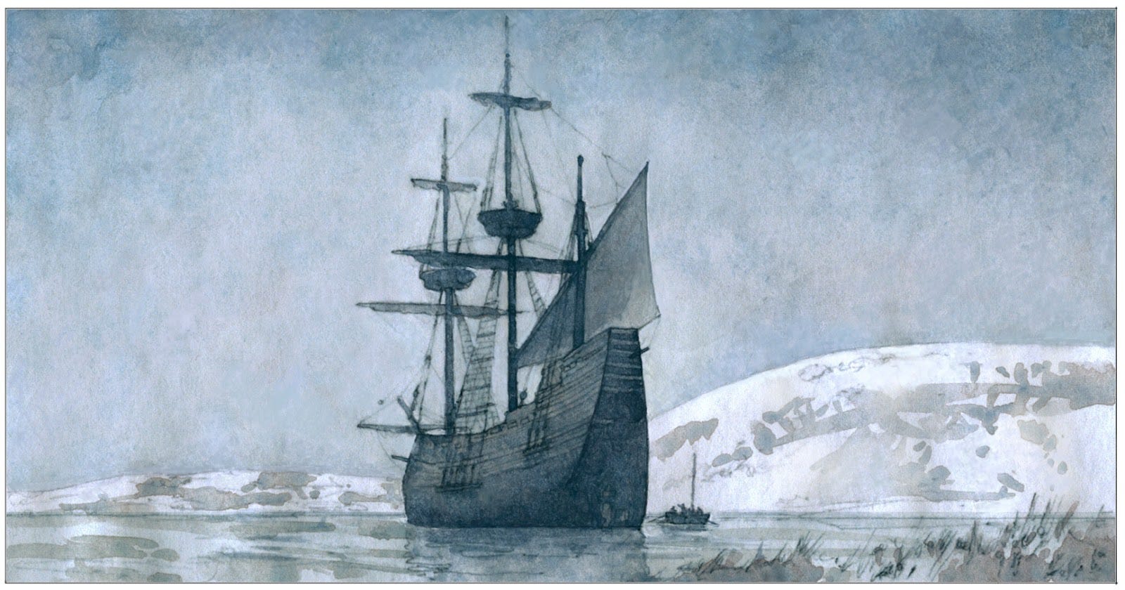
As I do every month during our art director meetings, I presented his sketches and color study to USPS, who enthusiastically endorsed our direction. With his sketch approved, Greg was set free to develop his color study into a final painting. In our following conversation, we discussed bringing more color to the painting because, even though his study bracingly captured the wintery environs, we recognized that the final artwork needed to be more vibrant. As a follow-up to our discussion, I received this winsome insight from Greg by email:
“I’ve been thinking about color and mood a little more. While taking a walk at sunrise this morning I witnessed a slice in heavy dark clouds where a small gash of orange light and a sense of the sun was revealing itself. Something like that might alleviate the bleakness (without changing much) and add that distant hopefulness the Pilgrims were certainly focused on. Just a thought. I could try a rough version if you still have time today.”
Greg is one of those rare artists who is able to articulate what he is imagining, so my instinct was to trust his instinct. I most assuredly encouraged his thinking and, although we had the inevitable back and forth exchanges that go into almost every piece of stamp art, the final painting from Greg was simply magnificent. All of the historic detail was in place, as was the somber sky set against the New England shoreline. But additionally, there was a “gash” of rising sun, illuminating the harbor and reinforcing the sense of anticipation we had been aspiring to achieve.
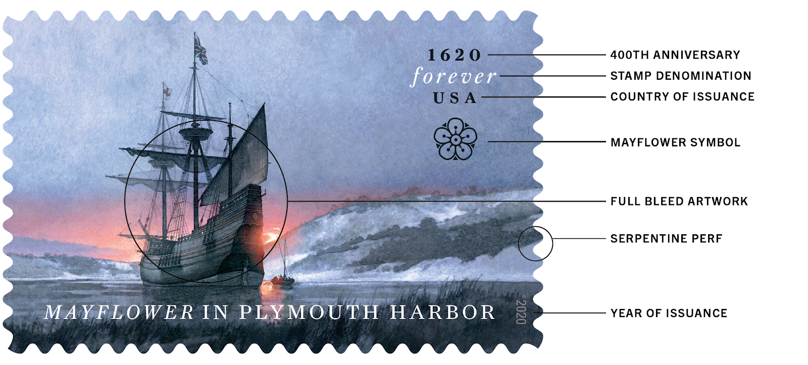
From the beginning of the project, Greg and I worked together on the composition of his painting, mostly to achieve an almost surreal sense of beauty, but also to create intentional space for the typography. Every commemorative stamp features the words FOREVER and USA, as reference to the perpetual first-class value of each stamp in the United States. The typeface for the project, Farnham, was designed in 2004 and inspired by an 18th-century German punchcutter — the craft of making traditional metal type.
The final stamp design allows the artwork to bleed — or extend — beyond the stamp perforations, giving the watercolor as much uninterrupted impact as possible. And as a final flourish, I drew a simple representation of the flowering shrub that inspired the name of the ship.
Since I began the project in 2018, new scholarship has revealed even more details about the landing of the Mayflower, some of which casts doubt on the original Thanksgiving. In his 2019 book, This Land Is Their Land, scholar David Silverman tells the story from the perspective of the indigenous people. In an article adapted for The Atlantic, Silverman writes that the Wampanoag Tribe had their own troubles, especially with neighboring tribes. Their warm reception of the Pilgrims was motivated, in part, by the potential of developing a military ally.
Our nation is engaged in ongoing conversation — a fresh historical reckoning — that is in harmony with the spirit of the age but also necessary to keep us from descending into myth. What is still true, however, is that the Pilgrims aboard the Mayflower were courageous and visionary, and they helped promote the promise of freedom in the New World.
The promise is great, but the work is not yet done. My hope is that the issuance of Mayflower in Plymouth Harbor keeps the conversation going.
